Flexbox
Note: Flexbox layout is most appropriate to the components of an application, and small-scale layouts, while the Grid layout is intended for larger scale layouts.
https://css-tricks.com/snippets/css/a-guide-to-flexbox/#flexbox-basics
---Flexbox 사용법
컨테이너에 아래의 코드 추가.
- display : flex;
그 후 컨테이너의 속성과, 컨테이너 안의 아이템들의 속성을 정의해서 요소를 배치한다.
#컨테이너 속성
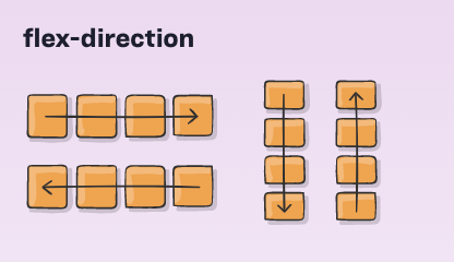
flex-direction
정렬할 방향을 지정한다.
- row (default)
- row-reverse
- column
- column-reverse
#body 의 direction 이 rtl 일 경우는 반대로 움직인다.
flex-wrap
지정한 공간을 벗어났을 때 요소들의 배치를 지정한다.
- nowrap (default)
- wrap
- wrap-reverse
flex-flow
flex-direction, flex-wrap 의 속성을 단축해서 쓸 수 있다. 아직 지원하지 않는 브라우져가 있으니 확인해봐야 한다.
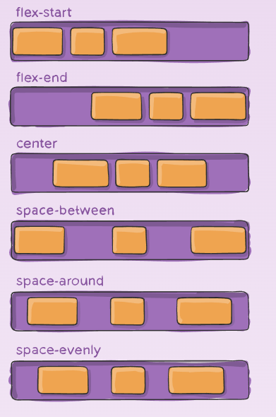
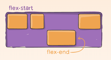
justify-content
플랙스 요소들을 가로선 상에서 정렬한다.
- flex-start
- flex-end
- center
- space-between
- space-around
- space-evenly
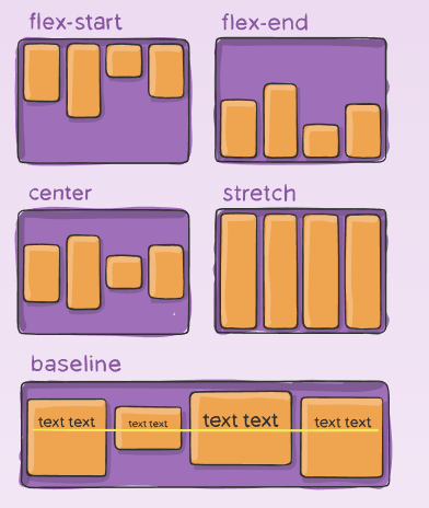
align-items
플랙스 요소들을 세로선 상에서 정렬한다.
- flex-start
- flex-end
- center
- stretch
- baseline
align-content
세로선 상의 여분의 공간이 있는 경우, 플랙스 컨테이서 사이의 여분의 간격을 조정한다.
- flex-start
- flex-end
- center
- space-between
- space-around
#아이템 속성
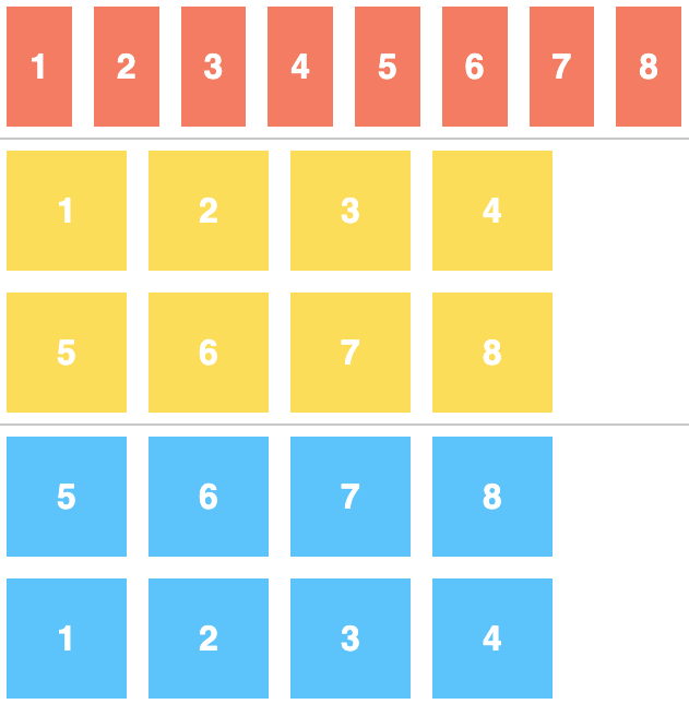
order
플랙스 요소의 순서를 지정한다.
기본값 0. 음수가 가장 첫번 째로 지정됨.
align-self
지정된 align-items 의 값을 무시하고, 플래스 요소를 세로선 상에서 정렬한다.
- auto
- flex-start
- flex-end
- center
- baseline
- stretch
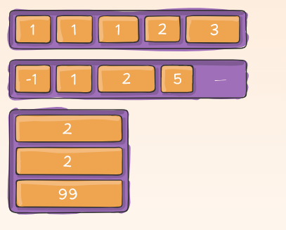
flex-grow
--
flex-shrink
--
#Flexbox 를 활용하여 요소들을 배치하는 게임
--답
1.
justify-content:flex-end;
2.
justify-content:center;
3.
justify-content:space-around;
4.
justify-content:space-between;
5.
align-items:flex-end;
6.
justify-content:center;
align-items:center;
7.
justify-content:space-around;
align-items:flex-end
8.
flex-direction:row-reverse;
9.
flex-direction:column;
10.
flex-direction:row-reverse;
justify-content:flex-end;
11.
flex-direction:column;
justify-content:flex-end;
12.
flex-direction:column-reverse;
justify-content:space-between;
13.
flex-direction:row-reverse;
justify-content:center;
align-items:flex-end;
14.
order:2
15.
order:-1;
16.
align-self:flex-end;
17.
order:3;
align-self:flex-end;
18.
flex-wrap:wrap;
19.
flex-direction:column;
flex-wrap:wrap;
20.
flex-flow:wrap column
21.
align-content:flex-start;
22.
align-content:flex-end;
23.
flex-direction:column-reverse;
align-content:center;
24.
flex-flow:column-reverse wrap-reverse;
justify-content:space-between;
align-content:space-between;
justify-content:center;
ref:
###한글로 된 완벽 가이드
https://heropy.blog/2018/11/24/css-flexible-box/
CSS Flex(Flexible Box) 완벽 가이드
많은 경우 float, inline-block, table 등의 도움을 받아서 수평 레이아웃을 구성하지만 이는 차선책이며, 우리는 Flex(Flexible Box)라는 명확한 개념(속성들)으로 레이아웃을 쉽게 구성할 수 있습니다. CSS F
heropy.blog
###영어로 된 가이드 (이미지로 쉽게 설명해 둠)
https://css-tricks.com/snippets/css/a-guide-to-flexbox/
A Complete Guide to Flexbox | CSS-Tricks
Our comprehensive guide to CSS flexbox layout. This complete guide explains everything about flexbox, focusing on all the different possible properties for the parent element (the flex container) and the child elements (the flex items). It also includes hi
css-tricks.com
https://bocoup.com/blog/dive-into-flexbox
Dive into Flexbox - design, tools and workflow - Bocoup
Introduction Flexbox is a new layout mode in CSS3 that is designed for the more sophisticated needs of the modern web. This article will describe the newly-stablized Flexbox syntax in technical detail. Browser support is going to grow quickly, so you’ll
bocoup.com
'HTML5&CSS3' 카테고리의 다른 글
| CSS3 - whitespace 속성 (0) | 2020.09.09 |
|---|---|
| CSS3 - HTML img 태그에 넣은 svg 파일의 색상 바꾸기 (0) | 2020.09.09 |
| CSS단위 vm, vh, vmin, vmax, px, em rem) (0) | 2020.09.07 |
| Semantic HTML 란? (0) | 2020.09.06 |
| display&position&overflow 정리 (0) | 2020.09.06 |


